Introduction to School Banners
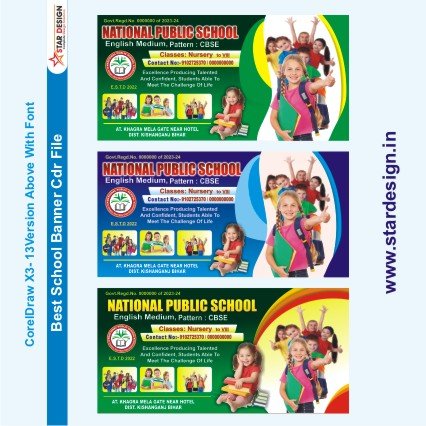
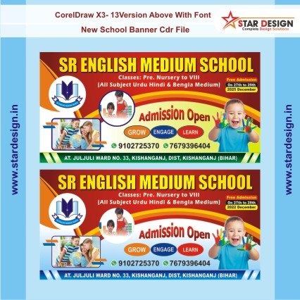
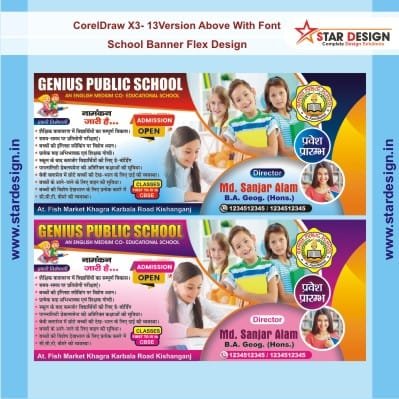
School banners play a critical role in shaping the identity and culture of educational institutions. These visually striking displays serve various purposes, from promoting school events to enhancing school spirit and unity. By embracing vibrant designs and strategic placements, banners can effectively communicate essential information to students, parents, and the wider community. Their importance cannot be overstated, as they provide a tangible representation of a school’s values and aspirations.
The presence of well-designed school banners significantly enhances visibility, helping to draw attention to important happenings such as sports events, academic competitions, and fundraising activities. They create an inviting atmosphere that resonates with current students and prospective families alike, thus fostering a sense of belonging among recipients. When a school invests in quality banners, it signals its commitment to excellence and community engagement, reinforcing its brand identity.
Moreover, school banners serve as excellent tools for showcasing achievements and milestones. As students excel in academics or athletics, their accomplishments can be celebrated through banners that highlight these successes. This not only boosts morale among students and faculty but also promotes pride among parents and guardians, creating a ripple effect of community support. The integration of engaging visuals and powerful messaging on banners transforms simple displays into motivational sources that inspire students to strive for greatness.
In addition, banners provide an avenue for schools to communicate their mission and values. By crafting messages that align with their educational philosophy, institutions can galvanize support from stakeholders, encouraging involvement in school activities. Ultimately, school banners are much more than decorative elements; they are vital communication tools that enhance engagement, promote school culture, and foster a positive educational environment.
Understanding CDR Files
CDR files are the native file format used by CorelDRAW, a vector graphics editor that provides a robust platform for designing high-quality graphics, including school banners. These files contain a wealth of information, such as images, text, colors, and vector graphics, that can be manipulated and customized within the software. The primary advantage of using CDR files lies in their scalability; vector graphics, as opposed to raster images, maintain their quality regardless of size adjustments. This characteristic makes CDR files highly suitable for creating large-format graphics, such as banners that may be displayed in various environments.
CorelDRAW allows users to work with CDR files efficiently, providing a range of tools tailored for graphic design. Users can easily create, edit, and export their projects, benefiting from features such as layering, effects, and precision drawing tools. Additionally, the program supports various design elements, allowing for creative flexibility in producing eye-catching banners that can capture attention and convey messages effectively.
Another advantage of CDR files is their relatively smaller file size compared to raster graphics, enabling quicker loading times when editing large projects. This efficiency can be crucial for designers who are working within tight deadlines or managing multiple bannner designs simultaneously. Furthermore, CorelDRAW’s continual updates ensure that the software remains compatible with the latest graphic design trends and printing technology, making CDR files a future-proof choice for educational institutions looking to invest in compelling visual communications.
In summary, the use of CDR files presents numerous benefits for the design of school banners, allowing for high-quality, scalable graphics that cater to various printing needs. The combination of CorelDRAW’s powerful tools and the advantages offered by the CDR format positions users to create visually appealing and professional banners effectively.
Planning Your Banner Design
The initial phase in creating a visually appealing school banner involves meticulous planning and preparation. This step is critical as it sets the foundation for the design process. To begin with, it is essential to define the banner’s purpose clearly. Understanding what the banner aims to achieve—be it promoting a school event, showcasing achievements, or fostering community pride—helps guide design decisions. The purpose will influence the banner’s content, visuals, and overall tone.
Next, identifying the target audience is crucial. Consider who will see the banner: students, parents, faculty, or the community at large. Each audience group has distinct interests and expectations that should shape the banner’s message. For instance, a banner designed for a school sports event may incorporate energetic imagery and motivational language, while one aimed at prospective students might focus on the school’s strengths and opportunities.
Key messages must also be clarified during the planning period. What is the core information or sentiment you wish to convey? This could include essential details like event dates, themes, or the school’s mission. A concise and impactful message can significantly enhance the effectiveness of your banner, ensuring that it captures attention and communicates clearly.
Additionally, brainstorming themes and sketching ideas are vital parts of this planning phase. Themes should resonate with the culture and values of the school, establishing a connection between the banner and its audience. Crafting initial sketches can help visualize these concepts and serve as a springboard for more polished designs. Consider incorporating elements such as the school colors, mascot, or logos for a cohesive look.
By dedicating time to planning your banner design thoughtfully, you lay a strong foundation for a successful and eye-catching final product that aligns with your school’s ethos and speaks to your audience effectively.
Choosing Color Schemes
When designing school banners, the selection of an appropriate color scheme is critical, as it plays a pivotal role in conveying your school’s identity and values. Understanding basic principles of color theory can facilitate this process. Color theory encompasses how colors interact with one another and the emotional responses they can elicit. For instance, warm colors such as red and orange can evoke feelings of excitement and energy, while cool colors like blue and green tend to promote calmness and trust. It’s essential to choose a palette that aligns with your school’s branding and educational ethos.
One effective strategy is to use contrasting colors to enhance visibility and ensure essential information stands out. High contrast not only grabs attention but also improves readability, making it easier for viewers to absorb the key messages on the banner. For example, pairing a light background with dark text or bright accent colors can create a visually appealing and functional design. This deliberate contrast also aids in directing focus where it is most needed, such as logos or important announcements.
Moreover, creating a harmonious look is vital for overall design coherence. Selecting colors that complement each other can enhance the visual appeal of your school banner. Utilizing a color wheel can be a helpful tool in identifying analogous colors—those that sit next to each other on the wheel—which can create a soothing effect and improve aesthetics. Furthermore, applying the 60-30-10 rule ensures a balanced distribution of colors: 60% of the dominant color, 30% of a secondary color, and 10% of an accent color. By incorporating these principles, your school banner will not only capture attention but also effectively convey the desired message.
Selecting Fonts for Maximum Impact
Typography plays a crucial role in banner design, particularly when creating eye-catching school banners. Selecting the right fonts not only enhances the aesthetic appeal of the banner but also ensures that the message is effectively communicated to its viewers. Given the often distant visibility of these banners, it is vital to prioritize readability. Fonts that are clear and legible from afar help to ensure that important information is quickly absorbed by passersby. Sans-serif fonts, for example, are typically easier to read at a distance compared to their serif counterparts, making them a popular choice for school banners.
In addition to readability, it is essential to choose fonts that align with the school’s identity. Each educational institution has its own character and values, which can be expressed through typography. For instance, a modern and progressive school might opt for sleek, contemporary fonts, while a traditional institution may select classic, more ornate typefaces. This alignment not only fosters a sense of pride among students and faculty but also communicates the school’s ethos to the wider community.
Another important consideration when selecting fonts is the hierarchy of information. Establishing a clear hierarchy through the use of varying font sizes and styles is imperative to guide the viewer’s eye toward the most critical information first. For example, the name of the school or the event should be the most prominent element, perhaps rendered in larger, bold font, while supporting details can be presented in smaller, lighter types. This structured approach ensures that the essential message of the banner is not only seen but also understood, fostering engagement and interest in the school’s initiatives.
Crafting an Effective Layout
When designing school banners, creating an effective layout is crucial for attracting attention and conveying the intended message. The layout serves as the backbone of the design, organizing visual elements purposefully to guide the viewer’s eye. Key principles of layout design include balance, alignment, and spacing, each playing a significant role in ensuring the banner’s overall effectiveness.
Balance can be classified into two types: symmetrical and asymmetrical. Symmetrical balance creates a sense of stability and calmness, often achieved by evenly distributing elements on either side of a vertical axis. Conversely, asymmetrical balance, while appearing less structured, captures interest by distributing visual weight unevenly. For school banners, using a combination of both forms can yield visually compelling results that draw in the audience.
Alignment is another important aspect of layout design, as it establishes a visual connection among the elements. Proper alignment helps create a clean, professional appearance, ensuring that text, images, and graphics are cohesively arranged. Utilizing grid systems or guidelines can aid in maintaining alignment and consistency throughout the design. Effective alignment not only enhances readability but also directs the viewer’s focus toward key information.
Spacing plays a critical role in establishing clarity and preventing visual clutter. Adequate spacing around text and images allows each element to breathe, improving overall comprehension of the banner’s message. It is essential to strike a balance between crowded elements and excessive white space, which can detract from the message. By using consistent margins and padding, the organization of visual elements can be refined, leading to a more professional look.
In essence, an effective layout in banner design combines balance, alignment, and spacing to create a visually appealing composition. These principles ensure that school banners not only attract attention but also relay information in a clear and engaging manner.
Including Graphics and Images
In contemporary design practices, the incorporation of graphics and images has proven to be vital in creating attention-grabbing school banners. The visual elements not only capture the viewer’s attention but also communicate information effectively. When selecting graphics for your banner, it is essential to ensure they resonate with the theme or message you aim to convey. The choice of imagery can significantly influence the perception of your design, thereby underscoring the importance of thoughtful selection.
When choosing photographs, consider their relevance and clarity. High-quality images that relate directly to the subject matter will enhance the overall appeal of your banner. For instance, if the banner promotes a school event, images showcasing previous events or related activities can evoke interest and familiarity. Additionally, it’s crucial that the photographs are clear and not overly cluttered, ensuring that viewers can decipher the intended message quickly.
Logos also play a pivotal role in the design of school banners. They serve as a recognizable symbol of the institution and can foster a sense of pride among students and faculty. When integrating a logo, it is important to ensure its placement complements other visual elements while maintaining a harmonious balance within the layout. Using established brand colors can enhance recognition while keeping the design cohesive.
In integrating graphics and images, pay close attention to the overall composition. The visuals should complement the text, creating a visually appealing synergy that guides the viewer’s eye. Proper alignment, spacing, and contrasting colors can help maintain professionalism while assisting in clarity. By making informed choices about graphics and images, school banners can achieve a professional look that is both engaging and effective.
Finalizing and Exporting Your Design
Once you have completed your school banner design using CDR files, the final steps are crucial to ensure the quality and accuracy of your project. Begin by conducting a thorough review of your design. Pay close attention to alignment, color consistency, and text readability. Additionally, check for any typographical errors that may have been overlooked during the design process. It may be beneficial to print a small-scale version of your banner to see how the design translates from screen to paper. This print can help identify any adjustments needed before finalizing the project.
After reviewing, make necessary adjustments. Utilize the features of the CDR software to modify elements such as fonts, colors, and images if they do not meet your vision. Ensure that any adjustments align with the overall theme and message of the banner, maintaining clarity and impact. It is also advisable to involve peers or stakeholders in this stage for constructive feedback, as different perspectives can provide insight into potential improvements.
Once you are satisfied with the design, it is time to export your CDR file. To do so, navigate to the export options in your software. Depending on your needs, you may choose different formats such as PDF for high-quality printing, JPEG for digital use, or PNG if you require a transparent background. Each format serves unique purposes, whether for physical banners or digital displays. Ensure that during the export process, you select the appropriate resolution, ideally 300 DPI for printed materials, to ensure the best quality outcome.
By following these steps, you not only prepare your school banner for printing and digital dissemination but also ensure a professional and polished final product that meets the intended objectives.
Displaying Your Banners Effectively
Displaying school banners in a manner that captures attention requires careful consideration of multiple factors, including placement, size, material types, and environmental conditions. The strategic positioning of banners is vital as it directly influences their visibility. Ideally, banners should be placed in high-traffic areas such as entrances, hallways, and event spaces where they can attract the maximum number of viewers. The height at which a banner is hung should be appropriate to ensure it is easily seen by people from various vantage points, including students, parents, and visitors.
Size is another critical aspect of banner display. The dimensions of a banner should correspond to its intended purpose and the area in which it is displayed. For instance, large banners can be effective in open spaces and are beneficial for catching the eye from a distance, whereas smaller banners may work well in more confined areas or as supplementary displays alongside other materials. Regardless of the size, clear and bold typography is essential for readability, ensuring that the message is conveyed quickly and effectively.
Material choice also plays a significant role in the longevity and visual impact of a school banner. Banners can be made from various materials, such as vinyl, fabric, or mesh, each offering different advantages. Vinyl banners, for example, are known for their durability and resistance to fading, making them suitable for outdoor use. Conversely, fabric banners offer a more refined look ideal for indoor environments. It is also important to use weather-resistant materials if the banners are intended for outdoor display to protect them from the elements.
To maximize the effectiveness of your school banners, consider using proper mounting techniques that stabilize them in windy conditions and prevent sagging. Additionally, regular maintenance checks can ensure that banners remain visually appealing over time, thereby reinforcing the intended message and contributing to the overall school atmosphere.












achat kamagra: Kamagra pharmacie en ligne – achat kamagra
pin up вход: пинап казино – пинап казино
вавада зеркало: vavada casino – vavada вход
vavada casino: вавада зеркало – vavada casino
вавада: вавада официальный сайт – vavada
pinup az: pin up – pin up az
pin up casino: pin-up – pin up