


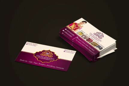
Luxury Magenta And Golden Business Card Design
The Power of First Impressions
In the professional realm, business cards serve as critical tools for first impressions, often acting as a tangible representation of an individual’s or company’s brand identity. The moment someone hands over their business card, several psychological factors come into play, influencing how they are perceived. Among these elements, color plays a significant role, as it can evoke feelings, create associations, and instill emotions that impact a recipient’s perception. This underscores the importance of carefully selecting colors that align with the intended message.
Magenta, a bold and energizing color, is often associated with creativity, innovation, and passion. By incorporating magenta into business card design, it not only catches attention but also communicates a sense of modernity and forward-thinking. On the other hand, gold is synonymous with elegance, success, and high value. Utilizing gold in a business card design conveys a message of luxury and builds immediate credibility. When these colors are combined, they create a striking visual that can captivate prospective clients, partners, or employers from the moment they glance at the card.
Moreover, the elegance of the card’s design contributes to the overall impact. An aesthetically pleasing layout, high-quality materials, and thoughtful typography communicate professionalism and can reflect the ethos of one’s brand. A well-designed business card does more than just provide contact information; it creates a sense of trust and respect, reinforcing the sender’s commitment to quality and attention to detail. Ultimately, the synergy between effective color choices, sophisticated design, and the inherent purpose of a business card positions it as a powerful element in cultivating lasting connections in the business world.
Color Psychology: Why Magenta and Gold?
The choice of colors in design plays a crucial role in conveying messages and eliciting emotions. Magenta, a captivating hue often recognized for its vibrancy, carries connotations of creativity, innovation, and luxury. This bold color signifies a departure from conventionality, attracting attention and sparking interest among viewers. Studies indicate that magenta can elicit feelings of excitement and inspiration, making it an ideal choice for those in creative industries or for businesses aiming to position themselves as trendsetters. By integrating magenta into business card designs, professionals communicate a dynamic and forward-thinking identity.
On the other hand, gold embodies a sense of wealth and success. This luxurious color is universally associated with prestige, high quality, and trustworthiness. Gold’s historical significance has established it as a symbol of prosperity and accomplishment. When incorporated into business card designs, gold enhances the perception of the brand as dependable and successful while eliciting feelings of admiration from clients and colleagues alike. Its reflective properties also contribute to a visual richness that elevates the overall aesthetic of the card.
The combination of magenta and gold creates a striking visual contrast that is both eye-catching and sophisticated. This pairing works harmoniously to convey a message of innovation backed by reliability. The vibrancy of magenta draws the gaze, while the solidity of gold establishes a foundation of trust. Consequently, business cards featuring this dynamic duo not only stand out but also leave a lasting impression, ensuring that the wearer is remembered for their unique style and professional dynamism. Together, these colors encapsulate a balanced and compelling representation of modern luxury and elegance in the business world.
Design Elements to Consider
Creating a luxurious business card requires careful attention to several critical design elements. Typography, layout, and texture play significant roles in conveying a sense of opulence. When choosing typography, consider fonts that reflect sophistication and professionalism. Serif fonts, known for their elegance, often work well in luxury designs. Opting for a hierarchy in font sizes can enhance readability while also guiding the recipient’s eye through the information presented.
The layout of a business card is equally important. A well-structured design allows for a seamless flow of information, ensuring that essential details stand out. Utilizing ample white space creates a clean and sophisticated look, making the magenta and golden accents pop. It is vital to avoid clutter; minimalist designs often evoke a greater sense of luxury as they emphasize the quality of materials and print techniques used.
Speaking of materials, choosing high-quality stock enhances both the look and feel of the card. Thick, textured cardstock not only has a premium presence but also lends durability. Implementing special print techniques such as embossing, foiling, and spot UV can elevate a standard card into a luxurious keepsake. Embossing creates a tactile experience, offering a three-dimensional effect, while foiling adds a lustrous sheen that draws attention. Spot UV coating can accentuate specific areas, enhancing visual contrast and creating a striking focal point.
Lastly, while design choices are important, they should always reflect professionalism and brand identity. Aromatic elements such as color combinations of magenta and gold can be used to communicate a brand’s personality without sacrificing clarity. Ensuring that all design elements work harmoniously is key to conveying an image of sophistication and high quality in business card design.
Sample Inspirations: Successful Designs
In the realm of business cards, a striking color scheme can set the tone for brand identity and client perception. The combination of magenta and gold is particularly compelling, offering a balance of vibrancy and elegance. Below are a few exemplary designs that showcase how this unique color pairing can effectively convey a brand’s message across various industries.
One prominent example comes from the fashion industry, where a luxury brand opted for a minimalist design with magenta as the primary background. The gold lettering of the brand name is sophisticated yet attention-grabbing, reflecting the exclusivity and high fashion appeal of its offerings. This design utilizes negative space effectively, allowing the eye to focus solely on the luxurious combination of colors and the brand messaging. The overall aesthetic creates an impression of modernity and refinement, which resonates well with its target audience.
In the technology sector, another design features a contemporary layout with geometric shapes. A magenta base sets the stage for a layered effect, with gold accents highlighting key information such as contact details and company logo. This dynamic appearance not only stands out in crowded business environments but also conveys a sense of innovation and forward-thinking. The strategic use of color intensifies readability while ensuring that critical information remains prominent.
Additionally, a financial services provider has successfully utilized the magenta and gold palette in their branding. Their business card features a textured gold finish, paired with bold magenta fonts, which evokes trust and sophistication. This design aligns perfectly with the company’s mission of providing premium services. Each of these selections illustrates that when executed thoughtfully, magenta and gold can enhance brand identity and make a powerful statement in professional networking situations.
Creating Your Own Luxury Business Card
Designing a luxury business card in magenta and gold requires a thoughtful approach that aligns with your personal and brand identity. Begin by brainstorming ideas for your card’s design. Consider the aspects of your brand that you wish to communicate — whether it’s professionalism, creativity, or a distinct personality. Start by sketching various layouts and styles, focusing on how the colors magenta and gold can work harmoniously to make a statement. Consider incorporating elements such as logos, patterns, and typography that resonate with your brand values.
Once you have a concept in mind, the next step is to select an appropriate printing service. Look for a printing partner that specializes in high-quality and luxurious finishes to ensure that your business cards reflect the premium appeal you desire. Pay attention to the material, opting for sturdy cardstock with a texture that adds to the luxurious feel. The printing method is also crucial; techniques such as foil stamping can enhance the gold accent and add an appealing tactile element. When assessing different printing services, request samples to ensure they meet your expectations for quality.
Quality assurance is paramount in the business card creation process. Double-check your design for any errors or inconsistencies before sending it off for printing. Ensure that all elements, such as contact information and logo placement, are accurate, as these details represent your professional image. Moreover, align the overall aesthetic of the business card with your personal values and brand essence, creating a lasting impression on your recipients. By following these steps, you will be well on your way to creating a standout magenta and gold business card that embodies luxury and professionalism in your network. In conclusion, take pride in the crafting process, as your business card serves as a vital tool in facilitating connections.
Luxury Magenta And Golden Business Card Design


BernardLot –
п»їpharmacie en ligne france: Medicaments en ligne livres en 24h – п»їpharmacie en ligne france pharmafst.com
BernardLot –
Kamagra Oral Jelly pas cher: kamagra gel – Kamagra Oral Jelly pas cher
Brianbub –
пинап казино: pin up вход – пин ап вход
Brianbub –
pin up casino: pin up azerbaycan – pin up azerbaycan
Brianbub –
пин ап казино: пин ап зеркало – пин ап вход